Companies change their logos every now and then. It’s a way to stay with the times, to fit in with this new modern digital age. Though, sometimes these changes remove any personality or uniqueness from their logos.
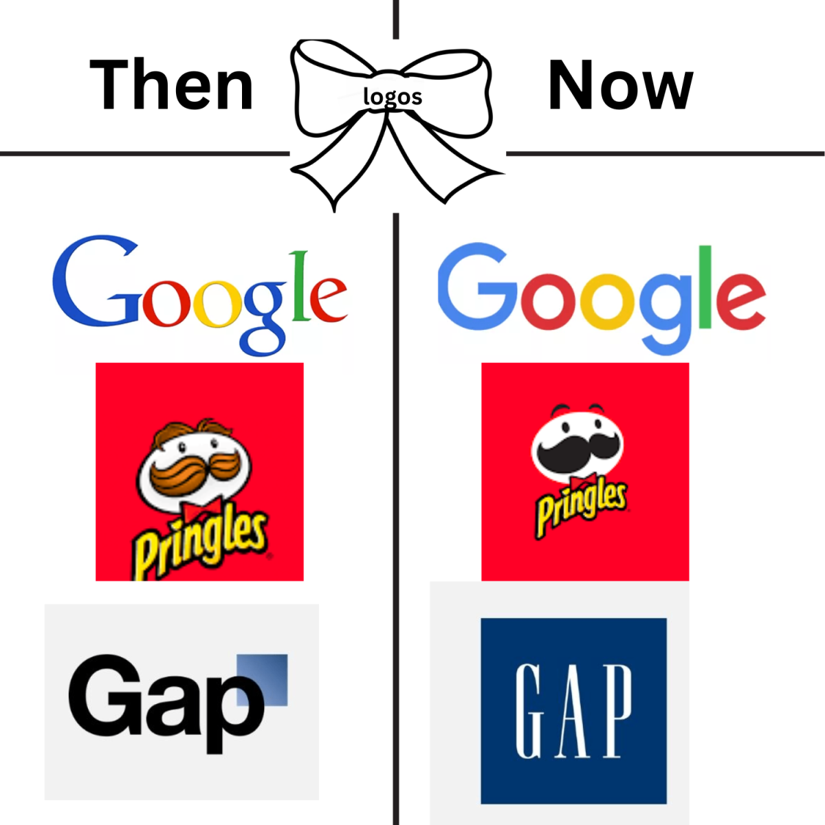
When Google originally revealed their new logo back in 2015, it received a lot of backlash. Changing the font from Catull, that began being used in 2010, to Product Sans, surprisingly made people extremely upset. Users claimed that the change seemed childish, as the unveiling itself was an animation of children drawing the logo with crayons.
After a while, the change began to grow on people. Google does everything, so the new logo works. It’s simple and works for everything. Although, it brought on a new trend of modernizing or oversimplifying logos to fit the digital age.
People disliked many of the logo changes of popular companies like Pringles, who completely removed the hair from their mascot Julius Pringles. Edge no longer looks like the iconic E with a ring around it, and HP whose new logo is just four lines. There have been some good ones, like Burger King, whose logo makes food look actually appetizing. Another example is Pepsi, who made a 27-page long document talking about the gravitational pull of Pepsi to validate their new design.
Mozilla had an amazing logo change back in 2016, making the company stand out. They didn’t follow what every other company began doing and instead made their logo more unique, changing the “I” to a colon and the “L”s to slashes. When they began changing the Firefox logo in 2017, people were left confused on how they could make themselves stand out with the Mozilla logo. Then Firefox almost completely erased the fox in the Firefox logo.
Chobani, similarly to Mozilla, had a change that improved their brand overall. By just simply changing the packaging to a creamy color and changing the font to Chobani Serif. These logo changes effectively made the products look more environmentally friendly and healthier, making people more likely to buy it.
Kraft completely changed their staple logo from the red boarder and blue text by removing the red boarder, lighting the blue and adding random colors. The changes were so drastic that people couldn’t recognize their brand, and they lost revenue. They were forced to go back to the previous logo. On the other hand, Heinz united their products by adding a boarder around their logo. This simplification made each individual product more recognizable to the Heinz brand and ended up increasing their profits.
In 2020, Gap decided it was also time for them to change their logo. They received some of the worst backlash, more than any other logo change. They changed their logo back in only six days. The change in total cost them $100 million. People claimed that it looked no longer like a clothing brand and more like a software company.
Fashion brands also decided to hop on this trend of making their logos oversimplified. Over half the brands claimed that their new fonts were sleek and professional. Though most of them are technically using different fonts, the resemblance is undeniable. Some supporters of the brands are stating that they might as well just use the default Microsoft font.
Balenciaga chose to completely drop the logo and changed their font to Utah Condensed Bold. Burberry went with a similar idea, also dropping their logo and changing the font to Proxima Nova.
Practically any other popular fashion brand did the exact same thing, the only difference being that the font names are different, but visually the fonts look the same. Some are just more bold or more stretched.
Corporate design is evolving to look more modern to fit a new age. Companies trying to make themselves stand out ultimately fail when everyone else also tries to go for the minimalist design. Oversimplification doesn’t work when everyone is hopping on the same trend. In the end, companies will lose personality and begin to look more corporate due to this new logo trend.


